ShopDreamUp AI ArtDreamUp

Deviation Actions


Description
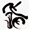
This is an abstract scene. I always think about a progression of my style. Recently I have submitted a scene with a black background. This is also one of them. If you like this, I'm glad.
This is one of WALLPAPERs and CHROMATIC SERIES.
You can get 1920x1200 pixels by download.
This scene has been made by 3dsMAX, Illustrator and Photoshop.
This is one of WALLPAPERs and CHROMATIC SERIES.
You can get 1920x1200 pixels by download.
This scene has been made by 3dsMAX, Illustrator and Photoshop.
Image size
1920x1200px 1.27 MB
Comments23
Join the community to add your comment. Already a deviant? Log In
Beautiful, interesting concept and beautiful idea. The flow of time can be seen moving on the picture clearly from winter to summer, growing from cold to warm, seed to fruit.
You can clearly see the thought flow and idea that went through the artist head while designing this beautiful piece. The broken pieces that make the picture give beautiful idea of fractality of time. How some time is short, others long, good and bad.
Also the flow of the year can be seen moving through the picture. How during the winter only few things live in sight, how things move or hide in order to wait for the first fruits to grow.
But being a critic I need to criticize.
The balance of the picture is slightly off, but not as hard compared to the earlier works from the artist. There has been clear improvement since my last critique on the series. The imbalance is caused by one slot missing a color at far left and the light blue being a bordering color.
Let me explain further:
The strong and warm, almost hot red at right left draws your eye out with all the movement and variety it has present. The light blue and white slot are too weak to be a drawing point to the eye. But because of the theme of the series I understand the execution by the artist. But the left side would have required some kind of boost to stay afloat.
The top of the picture could have used some more space. It feel slightly crowded at the top, but this can be understood. If you take a look at a particular details under the shape, the two shadows and their reflection. To fit these in artist clearly had to move the object up on the scene. Tho having a good filling and composition on the picture compensate a lot of this issue, you do not pay attention to this unless you are looking for flaws.
Talking of flaws there are very few. Which stands as a testament to the artist's skill, knowledge and understanding of the 3D workspace.
About the score:
Vision: 4½
-This is simply because the vision is unique as I mentioned above.
Originality: 4
-The vision and idea are interesting, but the theme of the object symbolism is old and used - still functional, but seen million times. I was originally going to give 3½ but then the idea of the piece is original in it's execution.
Technique: 4½
-The artist has clearly mastery over his tools, there is no arguing this.
Impact: 4
- I was going to give 4½ but I had to battle with myself, the picture was suffering from the imbalance of the picture - as mentioned above. But of all the pieces in this series, this had the greatest impact on me.
And to give my usual disclaimer of why no 5s. Because I believe that nothing is perfect, always room for improvement and learning.
On another note. This would be really cool table piece if it would be 3D printed and colored glass added to the frames. There is a thought for you artist - Hint Hint.